What's new in version 25.00?

webforJ version 25.00 is out now! This release includes brand-new UI components, functional improvements, and key architectural updates. Let's walk through some of the most exciting additions.
Planning an upgrade?
Ask the team what this release changes for your app.
Servlet 6 or later
webforj 25.00 now requires Servlet 6 or later. If you're using the Jetty Maven plugin for development, outlined in the Getting Started section, you must switch to the EE10 variant of the plugin instead of the older EE8 version.
See the upgrade guide to ensure a smooth transition from webforJ 24 to 25
Alert component
A new Alert component has been added in webforJ 25.00. This component provides contextual feedback messages for users, such as when displaying notifications, warnings, success confirmations, and more.
Alerts can be styled, themed, and optionally dismissed by the user.
Key features
- Themes: Use standard
Themevalues such asDEFAULT,PRIMARY,SUCCESS,DANGER, etc., to visually differentiate alerts. - Closable: Set alerts to be dismissible by the user with
setClosable(true). - Visibility control: Show or hide the alert using
open()andclose(). - Expanse support: Use
setExpanse()to control the sizing (e.g.,SMALL,MEDIUM,LARGE). - Content flexibility: Use
setText()for plain messages, oraddToContent()to embed components inside the alert. - Event handling: Listen for when the alert is closed by the user using
onClose()method.
Example usage
Alert alert = new Alert("Profile updated successfully!", Theme.SUCCESS)
  .setClosable(true)
  .setExpanse(Expanse.SMALL)
  .onClose(e -> {
    System.out.println("Alert dismissed by user.");
  });

mainFrame.add(alert);
InfiniteScroll & Refresher components
In addition to the Alert component, two additional components have been introduced in this release which are designed to interact with dynamic data: the InfiniteScroll and the Refresher components. These components aim to make interaction with dynamic data more efficient, and align with what users expect in a modern web app.
InfiniteScroll
If using the pagination is undesirable in your app, the InfiniteScroll component is a perfect fit. This component allows content to load continuously as the user scrolls down a page and is perfect for use cases like social feeds, product listings, or any scenario where data is retrieved in batches.
Key features
- Automatic loading: Trigger data fetching when the user nears the bottom of the viewport.
- Customizable indicator: Override the loading state with custom content using
addToContent(). - Icon and message control: Change the spinner or loading text with
setIcon()andsetText(). - Manual completion: Stop further loading by calling
.setCompleted(true)when there's no more data. - Scroll event handling: React to the scroll trigger with
onScroll()to load new data chunks.
Example usage
InfiniteScroll scroll = new InfiniteScroll("Loading more customers...");
scroll.onScroll(event -> {
  // Fetch and add more content here
});
After loading new content, simply call update() to reset the component and prepare for the next scroll trigger.
Refresher
The Refresher component brings native-like pull-to-refresh capability to webforJ apps, ideal for mobile devices. This addition further builds on webforJ's mobile support - especially when paired with installable apps, introduced in 24.21. Together, they allow you to build apps that look and feel native, in Java.
Key features
- Touch-based refresh: Triggers an event when the user pulls down from the top of the screen. This event can be used to reload data, perform updates, etc.
- Customizable Icons: You can define which icons appear during each stage of the refresh gesture:
setArrowIcon(): Shown while the user pulls down.setRefreshIcon(): Displayed while data is refreshing.
- Thresholds: Customize how far the user must pull before triggering a refresh:
setThreshold(): Minimum distance (in pixels) required to enter the "release to refresh" state.setThresholdMax(): Maximum pull distance to cap how far the component can stretch.
- Themeable: Integrates with your app’s look using
setTheme().
Example usage
Refresher refresher = new Refresher();
refresher.onRefresh(event -> {
  // Reload your data or perform updates
  refresher.finish(); // Always call when the refresh action is complete
});
Table enhancements
The 25.00 release brings two new features to the Table component: conditional styling and multi-column sorting. These additions give more control over the appearance and behavior of tables.
Conditional styling
Tables can now dynamically style individual rows and cells based on the data they represent. With the new setRowPartProvider() and setCellPartProvider() methods, you can apply custom CSS part names to rows and cells, enabling styles like conditional highlighting or state indicators.
// Apply alternating row styles
table.setRowPartProvider(person -> {
  int index = data.indexOf(person);
  return List.of(index % 2 == 0 ? "row-even" : "row-odd");
});
/* Apply CSS styling to the dwc-table::part */
dwc-table::part(row-even) {
  background-color: var(--dwc-color-default);
}
Borders and striped rows
25.00 introduces two highly requested enhancements for improving the appearance of tables in your app: customizable borders and striped rows.
These new styling options are simple to apply and help developers deliver clearer, more readable data presentations with minimal effort.
Customizable table borders
The new setBordersVisible() method controls which borders are displayed around and within your table. You can choose to show or hide borders between rows, columns, or around the entire table.
// Show all borders: rows, columns, and outer border
table.setBordersVisible(EnumSet.of(
  Table.Border.ROWS,
  Table.Border.COLUMNS,
  Table.Border.AROUND
));

// Remove all borders
table.setBordersVisible(EnumSet.noneOf(Table.Border.class));
This gives you full control over how your table is rendered - whether you prefer a minimal layout or a fully bordered grid.
Striped rows for improved readability
With the new setStriped() method, alternating background colors are applied to every other row, making large tables easier to scan visually.
table.setStriped(true);
Multi-column sorting
Sorting in tables has been overhauled in this release. By default, tables now use single-column sorting—clicking a column header will sort that column and clear sorting from others.
If your app needs more flexibility, multi-column sorting can now be enabled with:
table.setMultiSorting(true);
When active, users can sort by multiple columns in a defined order. The sorted columns are visually numbered to indicate their sort precedence, helping to clarify information display in more complex tables.
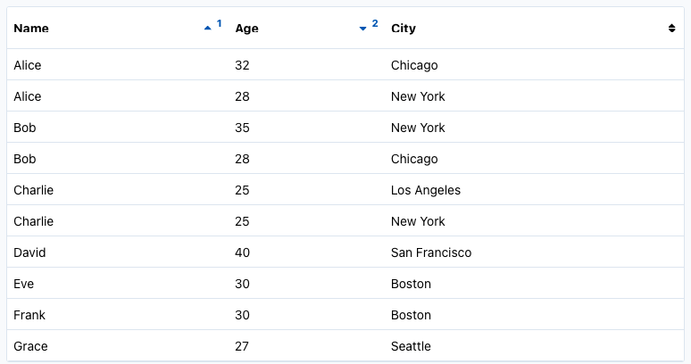
For server-side sorting, you can define sort priority programmatically:
column1.setSortIndex(1); // Highest priority
column2.setSortIndex(2); // Secondary
Desktop notifications
With webforJ 25.00, you can now notify your users beyond the browser with the new DesktopNotification component. This feature enables native desktop notifications that display system-level alerts, even if the web app tab isn't currently active.
To use this feature, make sure to include the following dependency in your pom.xml
<dependency>
  <groupId>com.webforj</groupId>
  <artifactId>webforj-desktop-notification</artifactId>
</dependency>
This is currently an experimental feature, and is subject to change in future versions.
These notifications are useful when informing users about new messages, system updates, or background events.
When and how notifications appear
Notifications will only be shown if the following conditions are met:
- The app is served from a secure origin (HTTPS).
- The user has interacted with the page (e.g., clicked a button).
- The browser has granted notification permissions.
- The app isn't running in incognito or private mode.
Once permission is granted, your app can trigger system-level alerts like this:
DesktopNotification.show("Order Received", "You have a new customer order!");
You can also configure the icon and attach event listeners for onClick, onError, onOpen, and onClose events:
DesktopNotification notification = new DesktopNotification("Upload Complete", "Your file has been uploaded.")
    .setIcon("icons://upload-icon.png")
    .onClick(e -> System.out.println("Notification clicked!"))
    .onError(e -> System.out.println("Failed to show notification."))
    .open();
As always, see the GitHub release overview for a more comprehensive list of changes.
Entwickelst du etwas mit webforJ?
Sprechen Sie mit dem Team über Ihr Projekt, eine Migration oder ob webforJ das Richtige für Sie ist.
Weiterlesen
 What's new in version 26.03?Get to know the features, fixes, and functionality new in webforJ version 26.03.
 What's new in version 26.02?Get to know the features, fixes, and functionality new in webforJ version 26.02.
 What's new in version 26.01?Get to know the features, fixes, and functionality new in webforJ version 26.01.